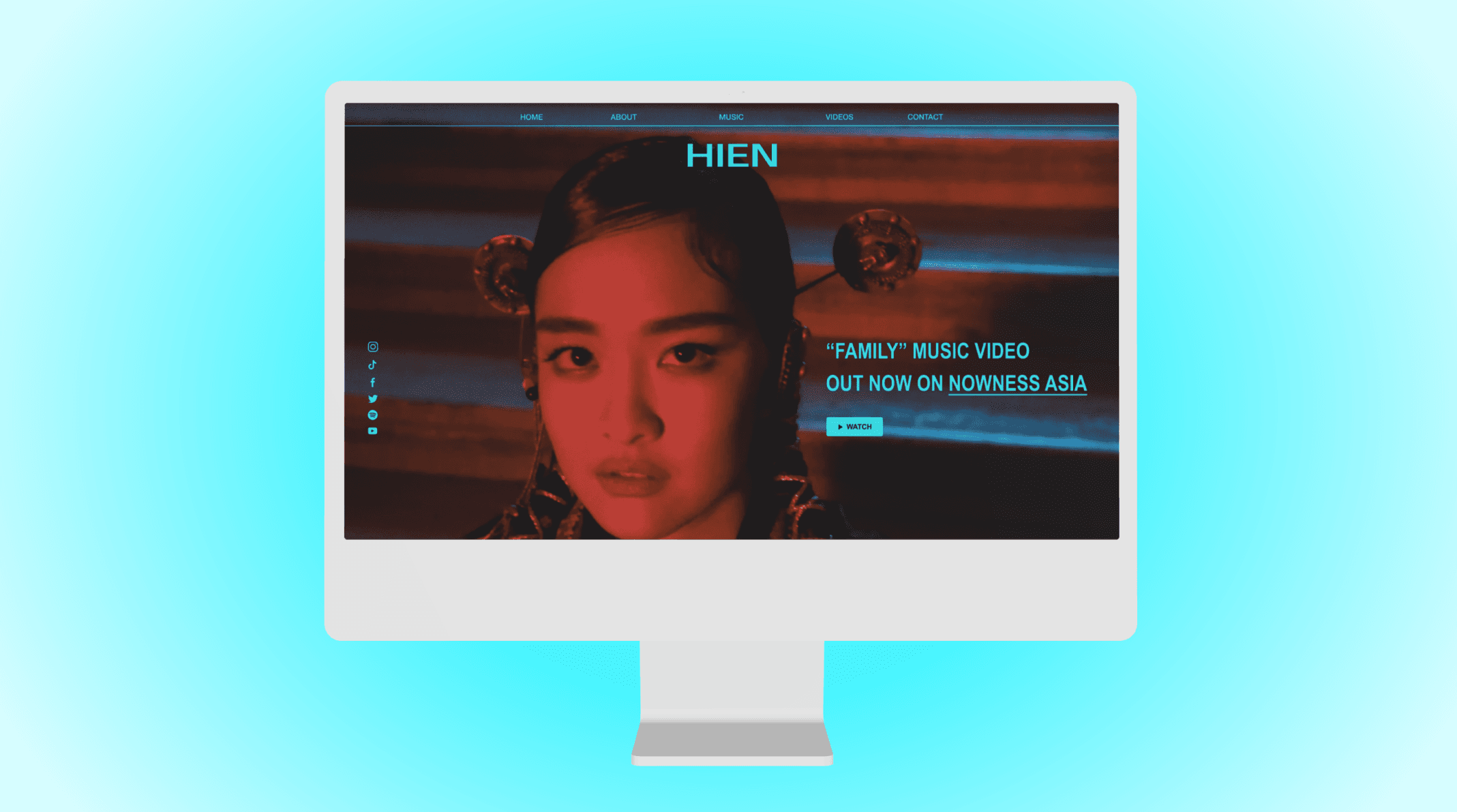
An artist website for a Brooklyn-based singer, producer, and sound designer.
Duration: 8 weeks
Role: UX/UI Design
Tools: Figma
PROJECT OVERVIEW
Emerging Brooklyn-based singer, producer, and sound designer Hien was looking to update her website to better align with current branding and contemporary UI trends. Her website’s target audience is professional contacts from record labels and brands.
SOLUTION
A responsive website marrying impactful visual design with UX best practices.
BACKGROUND
As an independent artist, Hien currently oversees all aspects of her branding and was looking to update her website to better align with her personal brand creative direction.
This site serves as a portfolio that she shares with professional contacts (from record labels, brands, etc.) to provide a quick snapshot of her recent work. The existing user interface of the site was a simple Squarespace template that lacked the personality and compelling visual design represented across her other assets and channels.
We aligned on the following goals for this website revamp:
Develop an attention-grabbing user interface reflecting Hien’s personal brand
Increase engagement from professional contacts that review the site
01. Research
LANDSCAPE RESEARCH
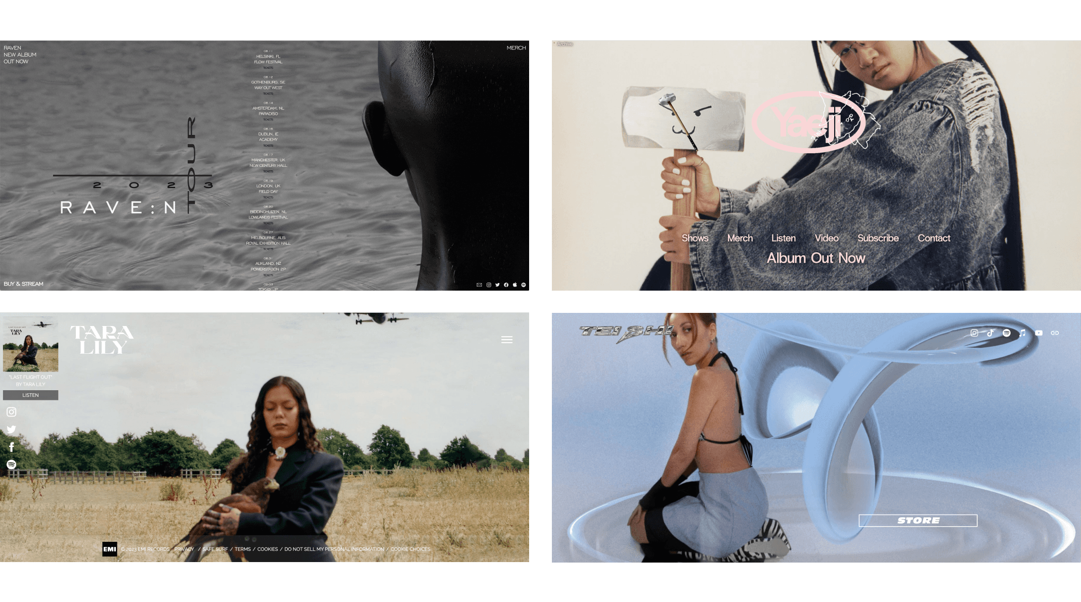
I began this project by exploring artist websites from musicians that Hien views as aspirational.
The following trends emerged across these sites:
Experimental interface design incorporating unexpected header and navigation bar placements, large scale images, and elements of gamification or animation
User experience felt secondary to the visual design on most of these sites and navigation didn’t align with best practices
Relatively simple sitemaps, with the majority of site components living on the homepage
With this in mind, I set out to create a straightforward yet visually compiling site that would incorporate unexpected, playful elements, while still protecting the user experience.
ASSUMPTIONS
Our target user segment of record label and brand executives was challenging for me to connect with directly, so I moved forward with two key assumptions about their needs and expectations:
Users will be on website for 1-3 minutes, need to access key info quickly
Users will except website design to reflect Hien’s branding
02. Define
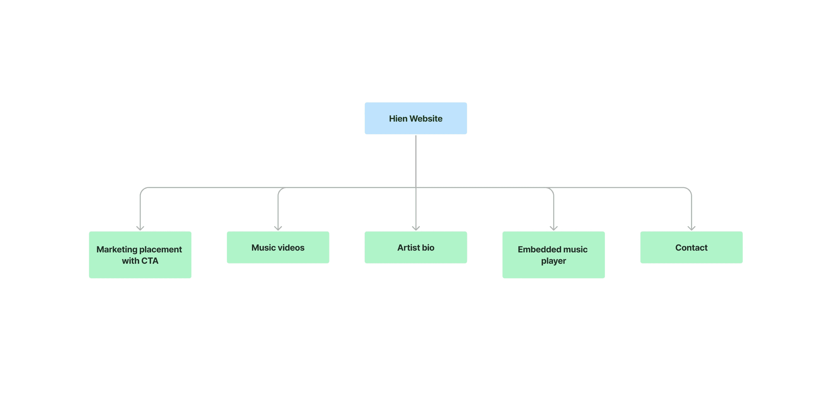
SITEMAP
Given the simple site layouts I encountered in my competitive research and the limited site visit time we were assuming from our target audience, I decided to maintain the existing site map and layout of Hien’s website which holds all site content on one page.
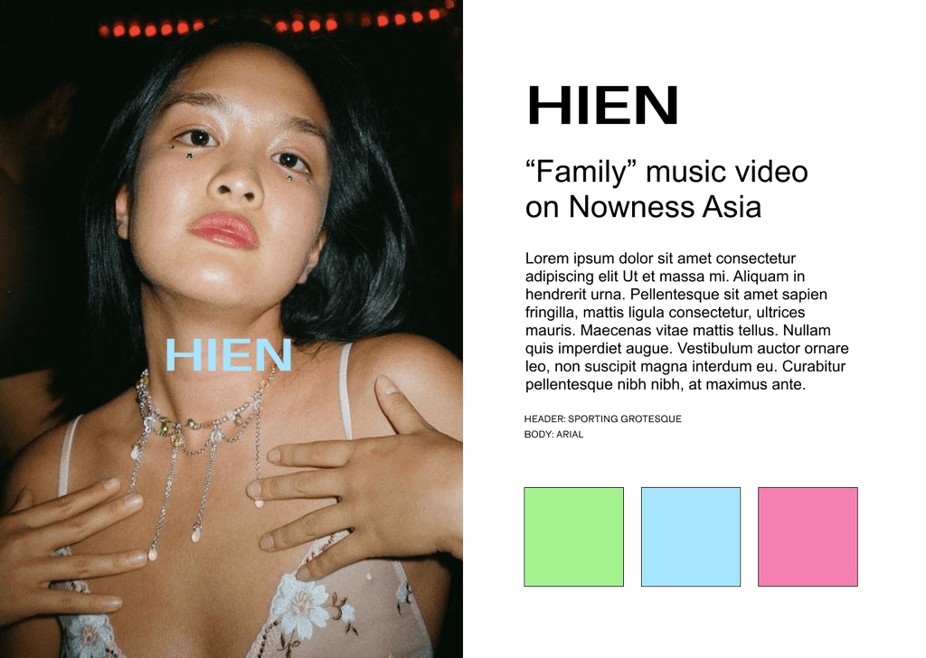
BRANDING
Representing Hien’s brand visually was a key component of this project, so I began my design process by compiling a mood board with visual assets from across her platforms.
The ethereal yet modern sensibility of these assets led me to pull in additional references with this sense of visual tension. References included pairings of serif and san serif fonts, use of colorful typography layered against softer photography, and elements of brutalist web design.
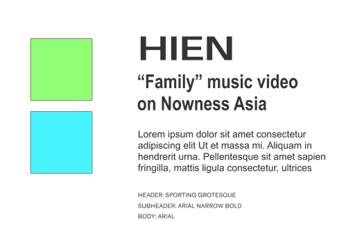
To gain alignment with Hien on the direction I was envisioning, I presented her with an initial branding proposal. She provided feedback that an all-caps sans serif font felt for her name/logo on the site, leading me to land on the following branding.
HIGH-FIDELITY WIREFRAMES
After initial sketches, I jumped into high-fidelity wireframes that would allow me to integrate Hien’s visual assets and the branding elements we had landed on into the designs.
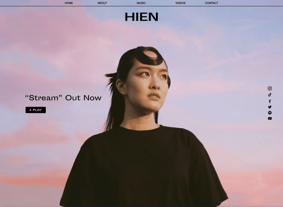
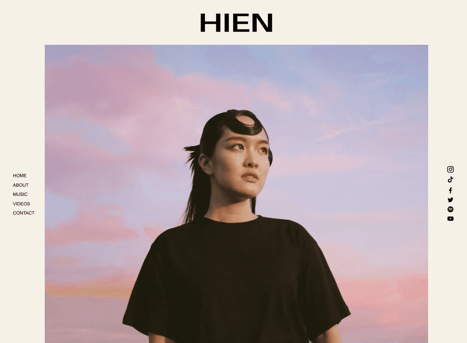
I wanted to present various options to Hien as a starting point, so I developed two desktop wireframes (Option 1 and Option 2), as well as mobile wireframes. The desktop versions primarily varied in the header designs, which explored different navigation bar placements.
04. Iterate
ITERATION
Hien resonated with the Option 1 but requested a working session to discuss and evolve the design.
During this call, we pivoted the font and color pallet to feel a bit more pushed and experimental, selecting Arial Narrow and neon colors that popped against her editorial imagery.
FINAL WEBSITE
See the live website built in Framer here → and below.
CLOSING THOUGHTS
This project provided me with an opportunity to engage directly in client work, helping to build my expertise in client asset compilation and presentation, as well as iteration based on client feedback.
As a part of this process, I became an advocate for the needs of the end user, ensuring that copy readability, color accessibility, and clear navigation were all protected.
I also balanced this usability work with pushing myself to create a compelling visual design that would capture the attention of potential professional contacts with limited time and attention spans.
