A move planning & budgeting application for New Yorkers.
Duration: 16 weeks
Role: UX/UI Design, User Research
Tools: Figma, Miro, Otter AI
PROBLEM
Moving is a very stressful experience no matter where you are based, but New Yorkers also face an outsized cost of living along with compressed move timelines due to the structure of the real estate market.
These two factors combine to create significant stress for folks moving within the five boroughs.
SOLUTION
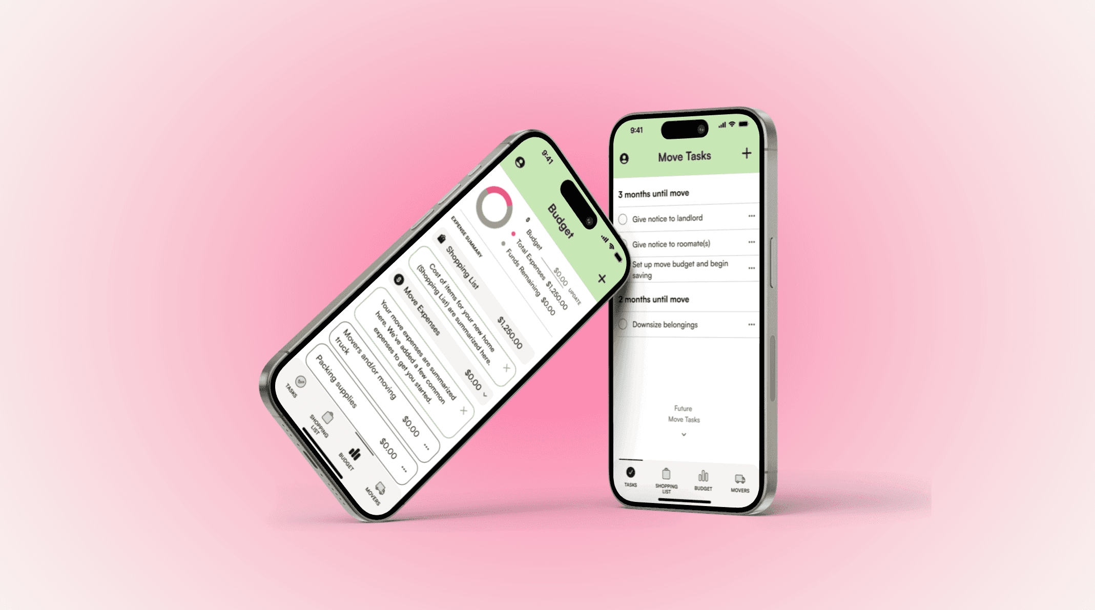
Movelet is a move planning and budgeting mobile app that delivers a feature set designed to help alleviate stress and save time for users planning moves within New York City:
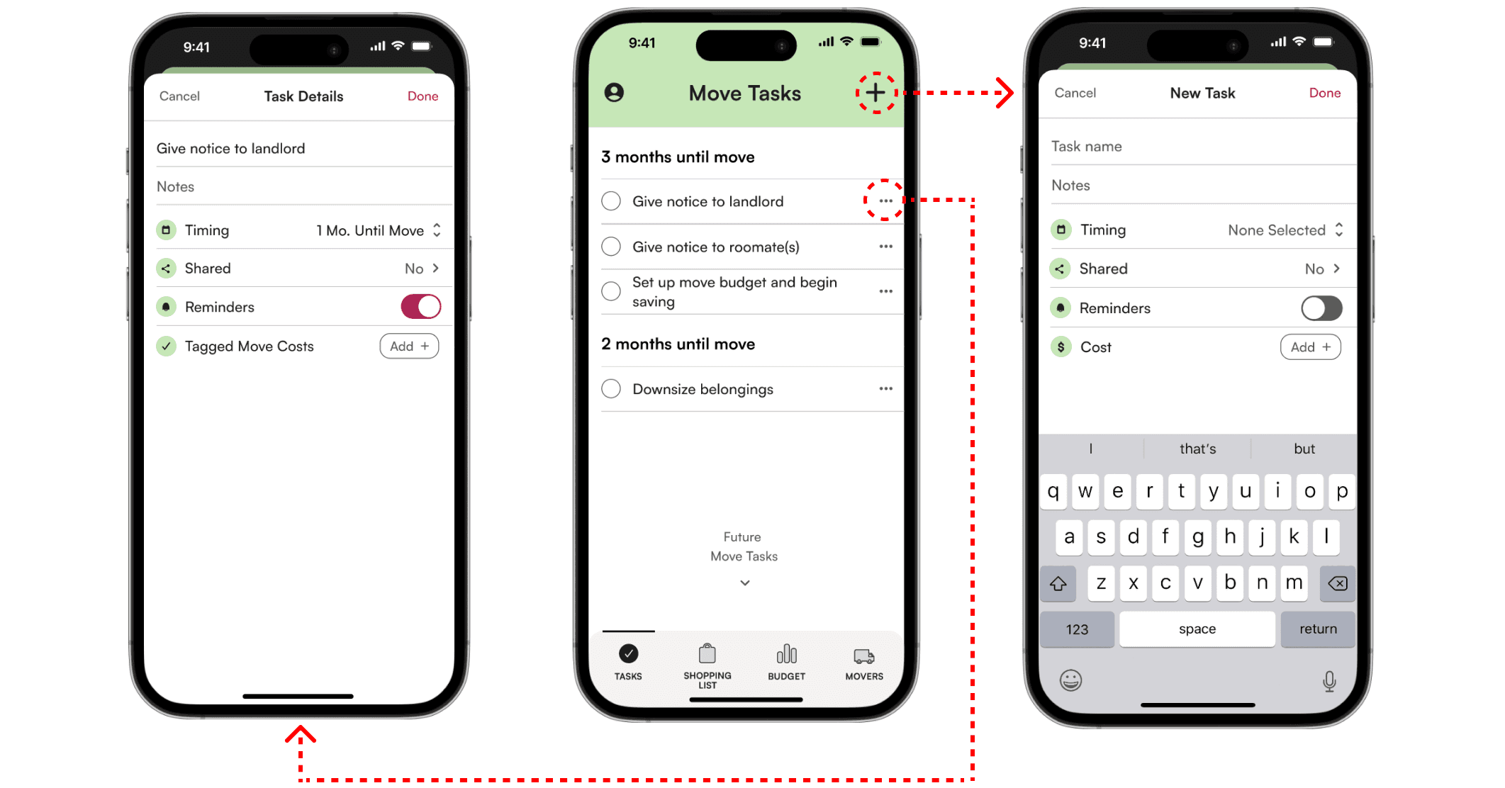
TASKS feature which comes with a pre-loaded checklist of common move tasks, organized chronologically
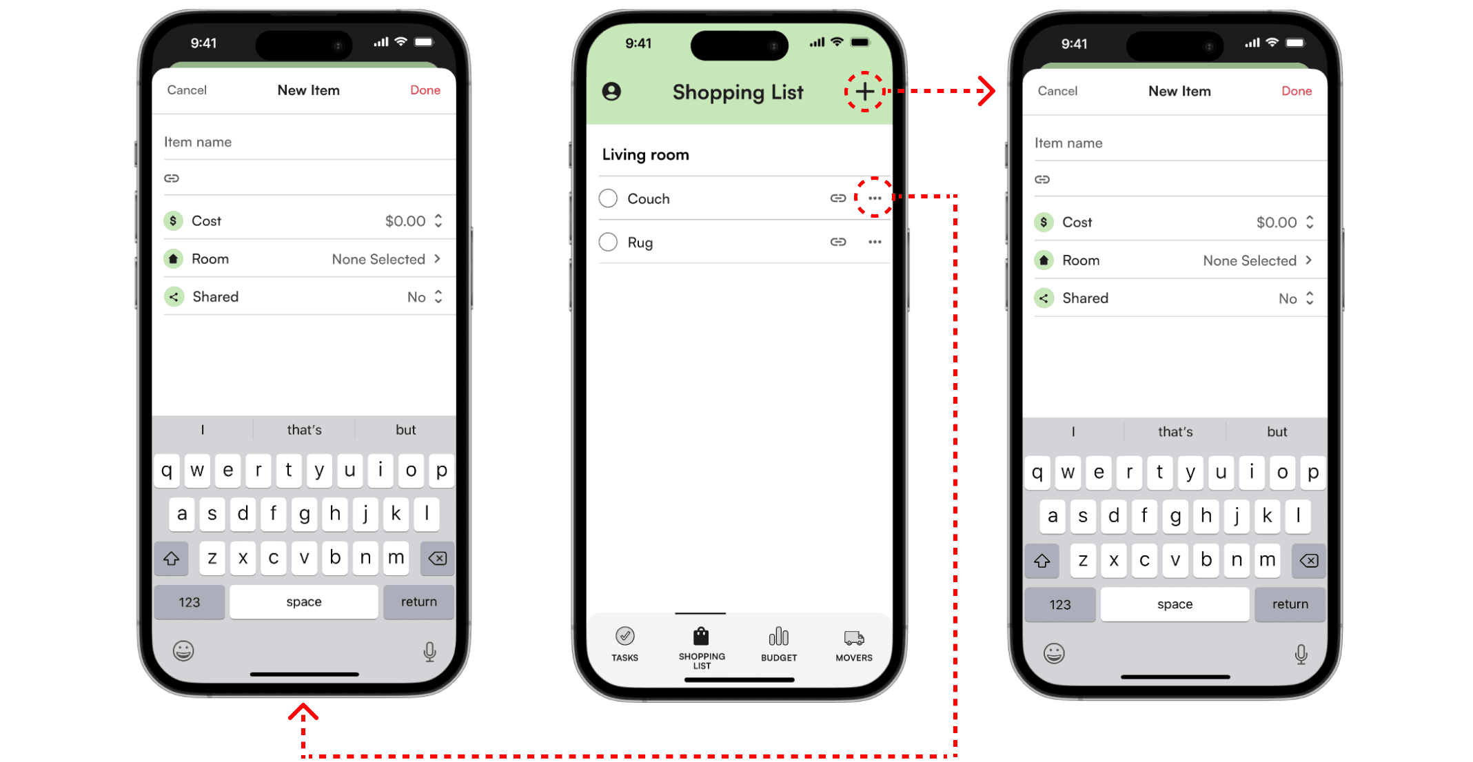
SHOPPING LIST feature allows users to save purchases for their future home and integrate purchase costs into their budget
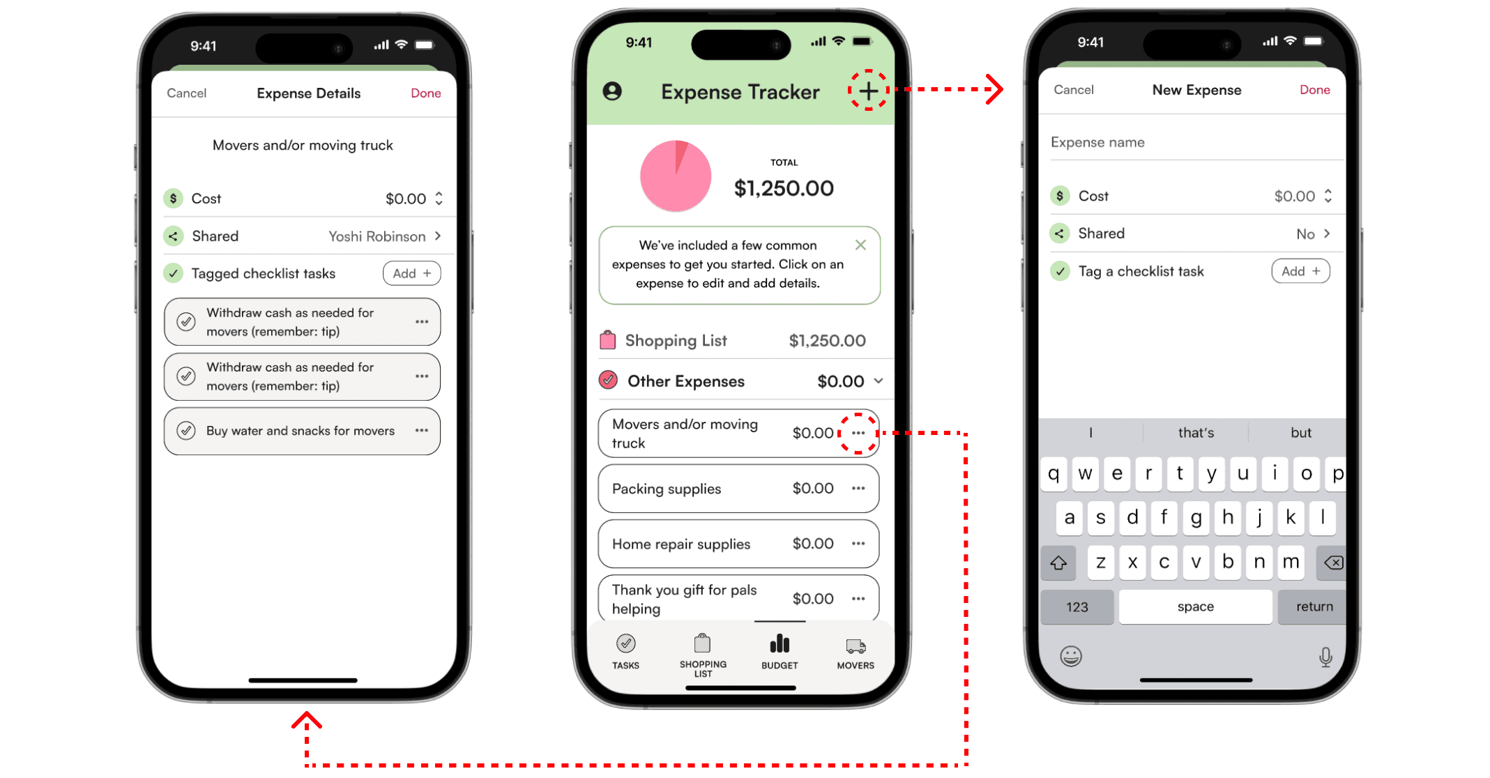
BUDGET feature allows users to create a move budget and track their moving expenses
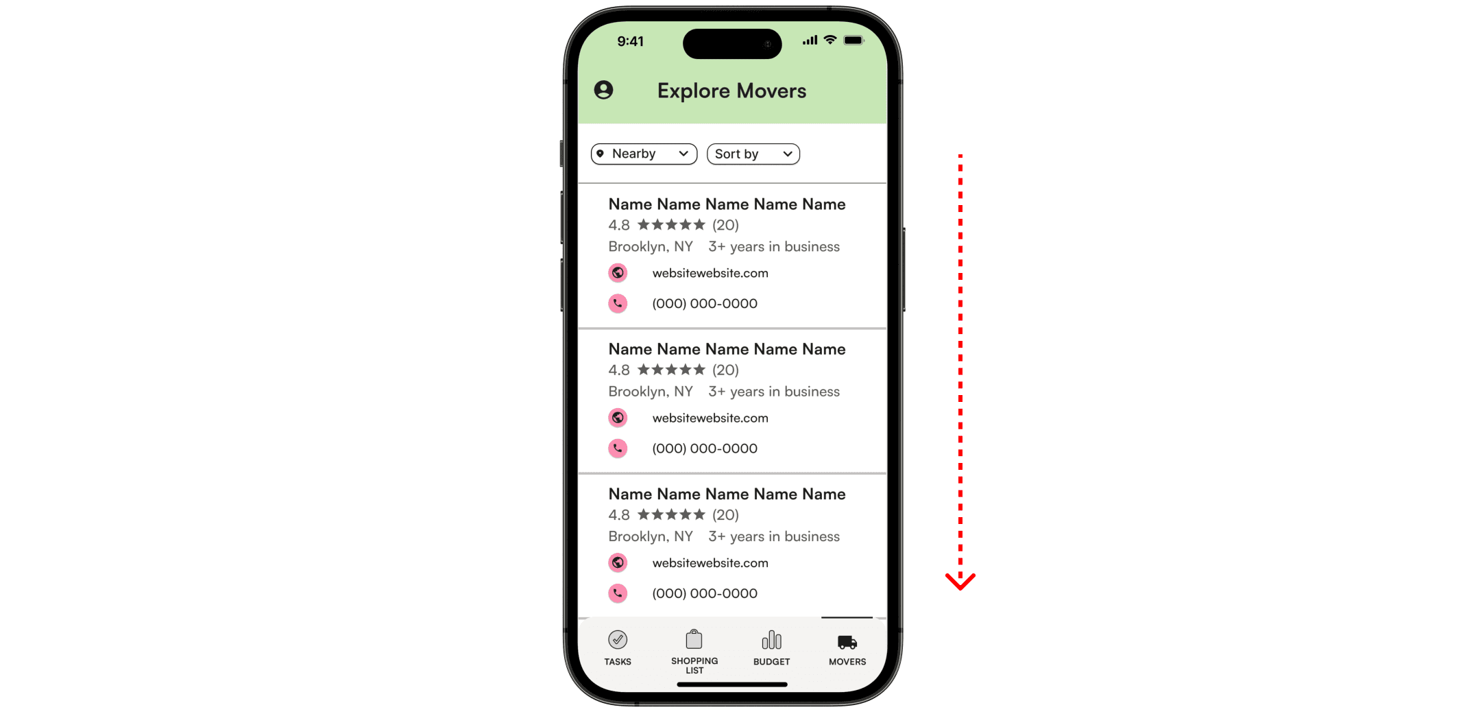
MOVER feature will feature a directory of local movers
These tools are presented through a friendly, familiar UI inspired by the iOS interface that our user research indicated as a preferred planning tool for our target audience.
01. Research
MARKET RESEARCH
My investigation began with market research to gain a better understanding of how people were discussing moving and move planning in digital spaces.
This included reading moving tutorial articles, watching moving tutorial Youtube videos, and reading through the r/moving subReddit.
COMPETITIVE ANALYSIS
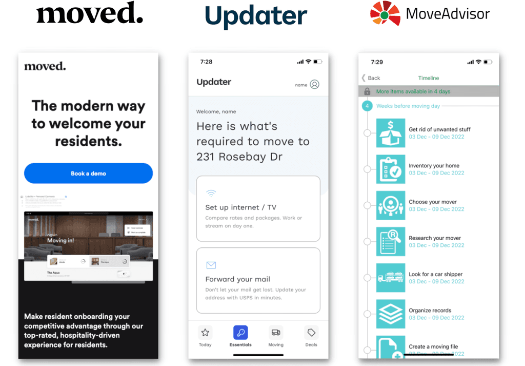
Equip with this information, I completed a comprehensive competitive analysis of (3) three move planning applications currently on the market and evaluated their feature sets, strengths, and weaknesses.
While none of these applications provided the seamless planning support I envisioned for my own tool, evaluating their features did provide good thought starters.
USER INTERVIEWS
RESEARCH FINDINGS
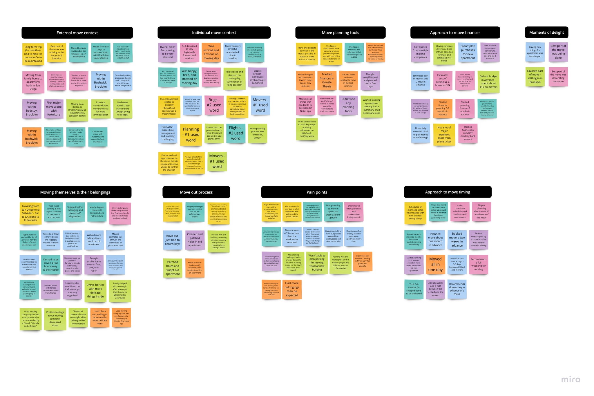
Through my market research and user interviews, I discovered that moving is a highly emotional experience for many people with stress, anxiety, and excitement as commonly mentioned keywords.
FINANCIAL STRESS Many folks expressed stress around financing their moves and ensuring they stayed within their budgets.
NEW YORK All New Yorkers interviewed called out stressors specifically tied to moving within NYC, including short move timelines, outsized costs, and the physical labor of walking/Ubering belongings to their new home.
ACCOMMODATIONS Folks with disabilities also spoke to the difficult process of accessing accommodations and the stress and harm caused by improper accommodations.
NOTES APP gleaned insights around how people are currently planning their moves, including the iOS Notes App which was mentioned frequently.
PERSONA
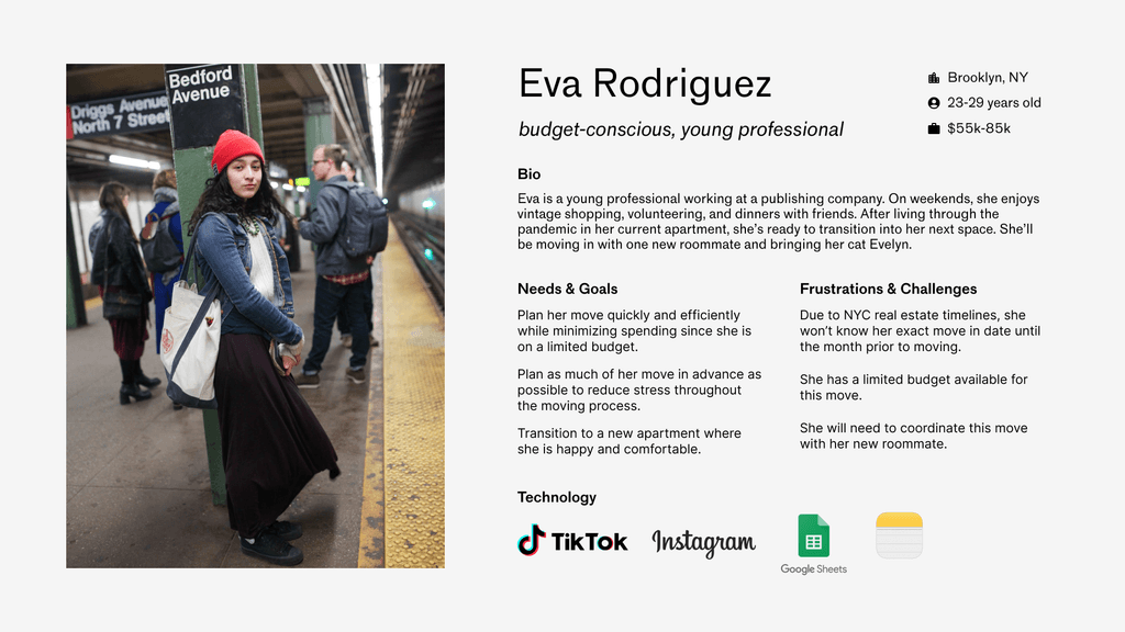
The persona I created embodies the most pervasive goals, motivations, needs, and frustrations that emerged during my user interviews, particularly those expressed by New Yorkers. Having listened to interviewees share their unique struggles associated with living in the city, it felt appropriate to anchor my persona in this location.
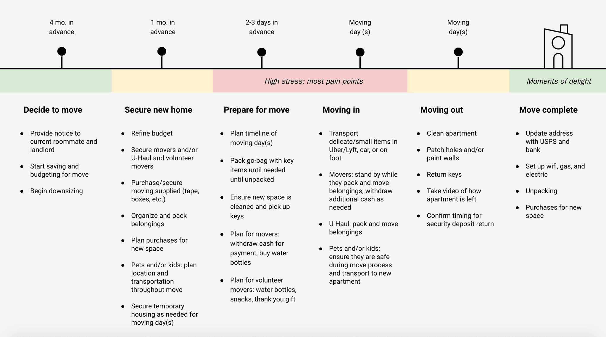
PERSONA TIMELINE
I also synthesized the experiences and timelines that New Yorkers shared into a move timeline for my user persona.
02. Define
"HOW MIGHT WE" QUESTIONS
As I began the process of defining my product, I synthesized my research findings into (3) three “How Might We” thought starter questions. These provided a jumping off point for my ideation activities.
How might we help people moving in NYC to reduce stress associated with short move timelines?
How might we help people moving with limited financial resources to better afford their moves?
How might we help people moving with disabilities to reduce likelihood of physical and emotional harm stemming from lack of accommodations?
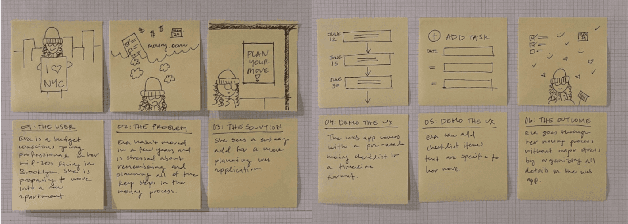
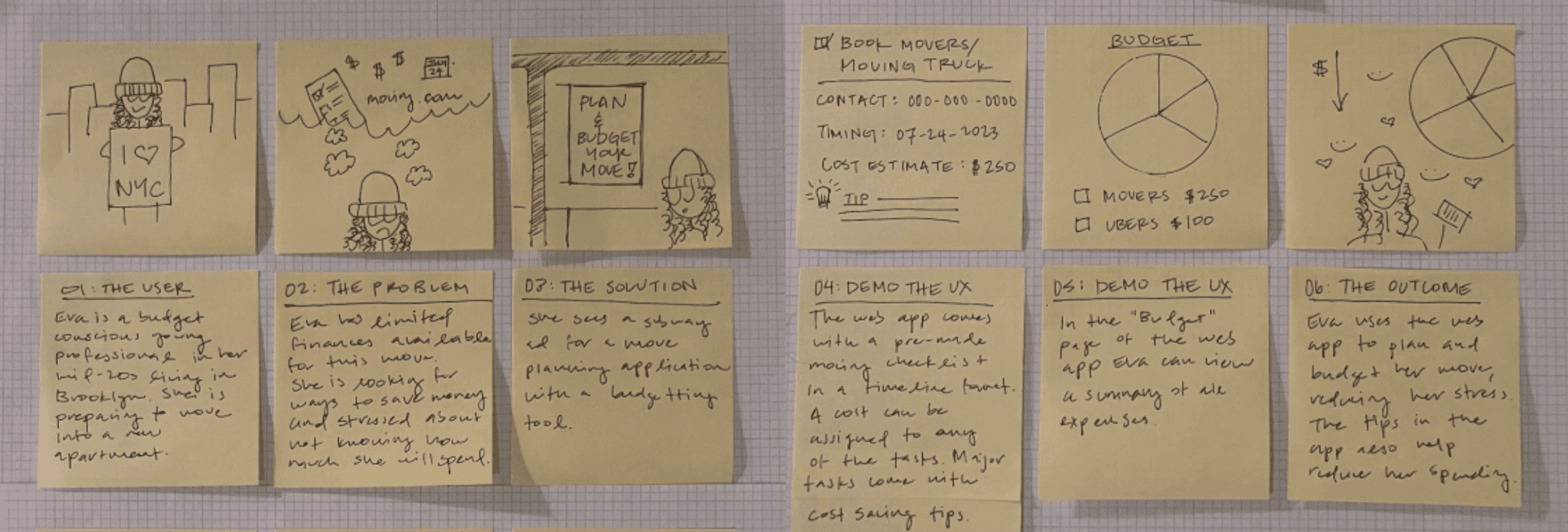
STORYBOARDS
I then developed storyboards exploring how my persona might engage with these two features. This exercise helped validate the overlap between how they would engage with both features and confirmed that these two features could likely co-exist within one product.
FEATURE DEFINITION
Market landscaping around planning tools and well as interviewees' preference for iOS Notes app, led me to select a mobile application as the format for my product. A mobile app can also easily be accessed while users are on-the-go throughout their moving process.
With my two features as a starting point, I developed a comprehensive feature roadmap of what I wanted this app to encompass. I then prioritized which features were crucial to an MVP version of my product:
TASKS feature which comes with a pre-loaded checklist of common move tasks, organized chronologically
SHOPPING LIST feature where users could save purchases for their future home and integrate purchase costs into their budget
BUDGET feature where users to could track their moving expenses
MOVER feature will feature a directory of local movers
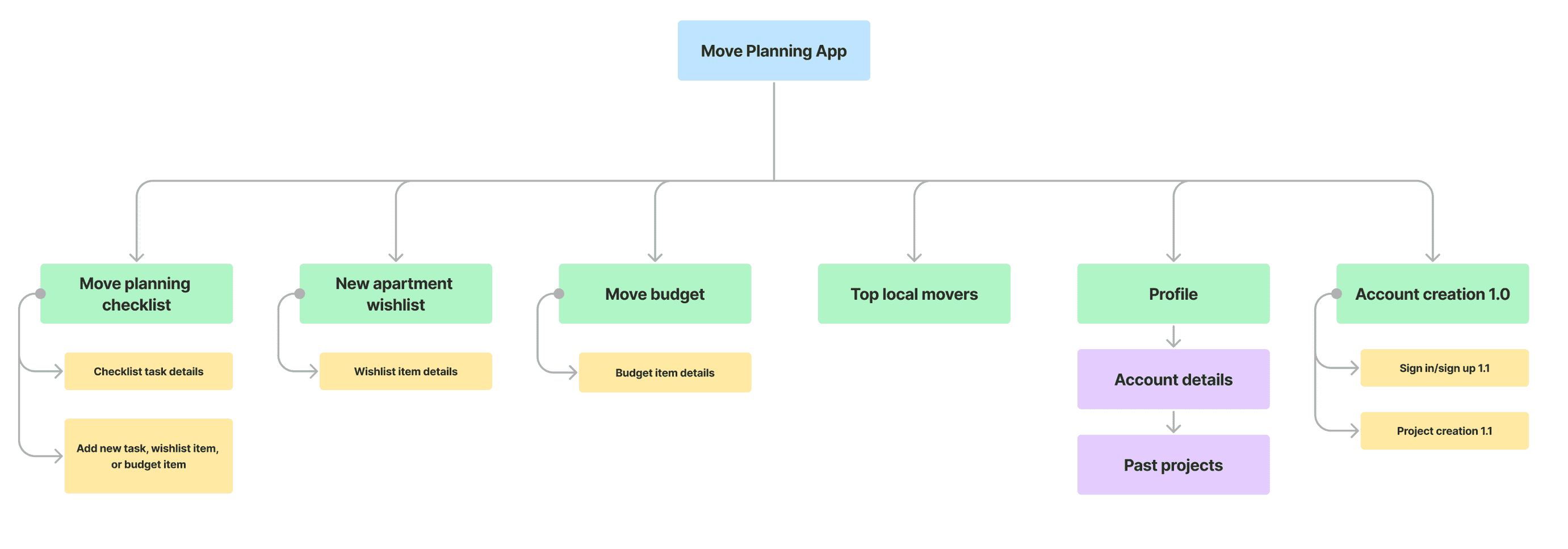
SITEMAP
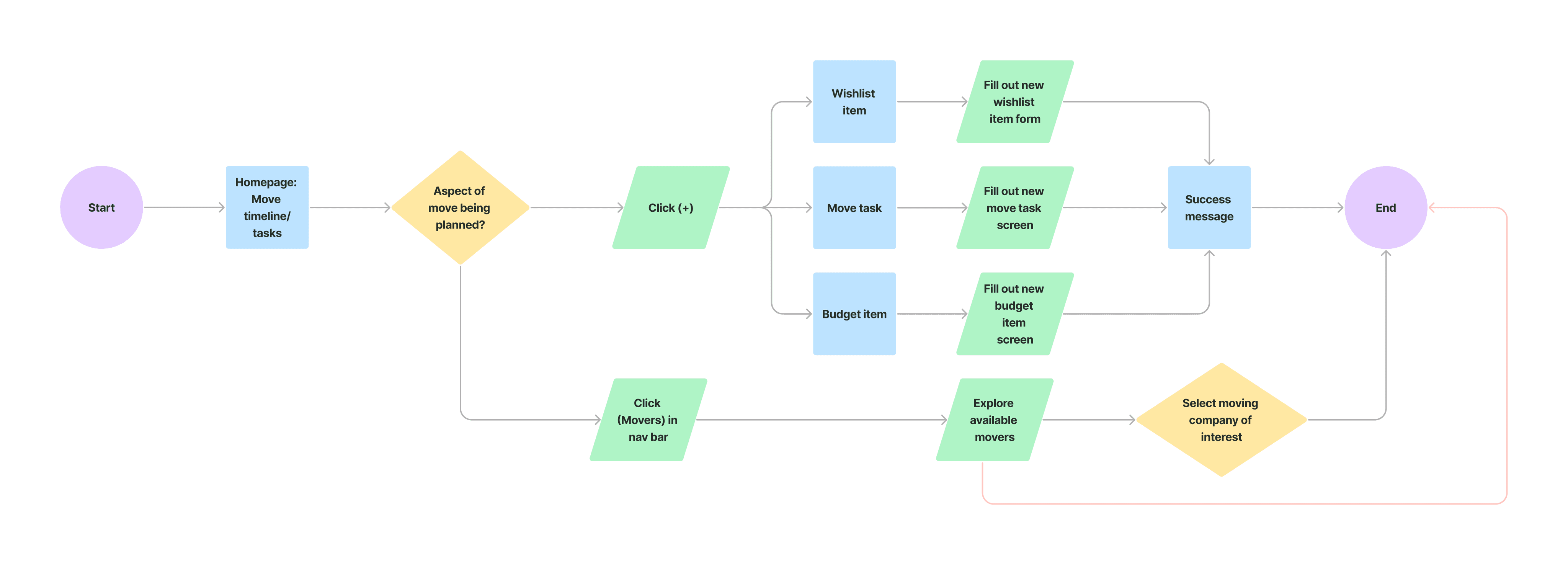
USER FLOW
LOW & MID-FIDELITY WIREFRAMES
My user flow guided the screens I developed for my low-fidelity wireframes. My sketches and later digital screens in Figma allowed me to receive initial feedback on the basic visual architecture of the app. I then moved into more complete mid-fidelity screens.
BRANDING
With my user goals and persona in mind, I defined four pillars for Movelet’s brand identity: user-centered, friendly, optimistic, helpful. From these pillars, emerged the concept of Movelet’s mascot, a moving box come-to-life to support users through the moving journey.
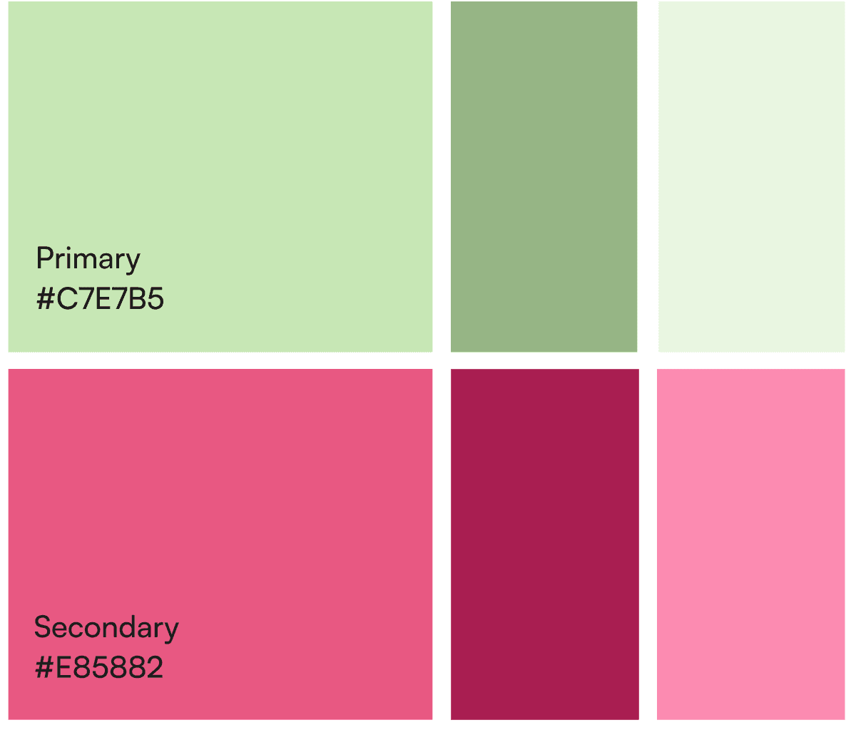
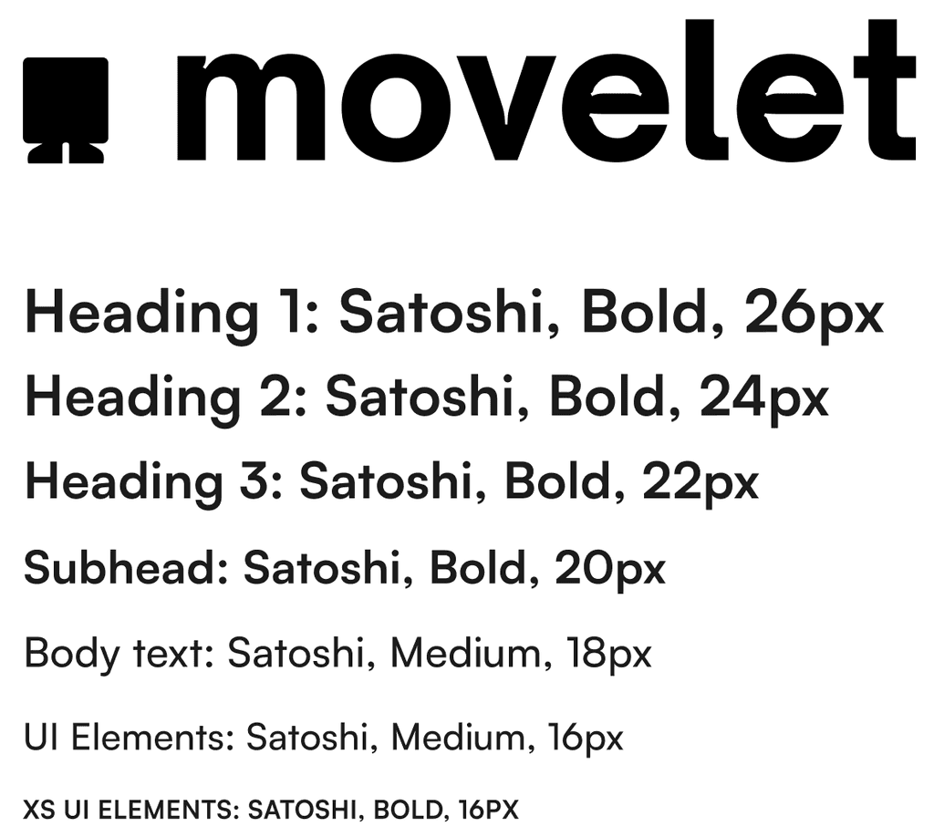
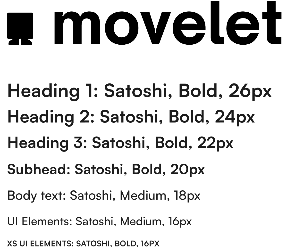
This friendly character and sensibility drove me to select fresh greens and energetic pinks as the app’s color palette and, Satoshi, a contemporary yet cheerful sans-serif typeface.
At this stage, I also decided to lean into the iOS design patterns and UI that users are already comfortable with.
HIGH-FIDELITY WIREFRAMES
Utilizing my branding elements, I evolved my greyscale screens into my high-fidelity wireframes and strung them together in Figma into an interactive prototype.
A pre-loaded checklist of common move tasks for New Yorkers, organized chronologically to align to my Persona's move timeline. Includes functionality for users to add, edit, and move tasks. Users can also, share tasks with other users, turn on reminders, and attach expenses from the Budget feature to specific tasks.
A centralized location for users to save their planned purchases for their new home. Items can be categorized by room and shared with other users. Costs from items automatically populate in the Budget feature.
An expense tracker where users can plug in and track their move expenses. Includes a summary of costs from the Shopping List feature. Common move expenses included to get users started. Users can also attach expenses to specific tasks from the Tasks feature.
A directory of local movers based on the user's location. MVP version of app will included data scrapped from Google but opportunity for future iterations to monazite listings as a revenue stream.
04. Test & Iterate
USABILITY TESTING
With my interactive prototype completed, I moved into usability testing. I conducted six (6) usability tests with users closely aligned with my persona to evaluate users’ ability to move through key Movelet task flows and any potential areas of friction or confusion.
ITERATION
All six (6) users successfully completed all key tasks and half mentioned unprompted that interface felt easy to understand and similar to other checklist apps they use (Todoist, iOS Notes app).
I also identified three key opportunities for iteration:
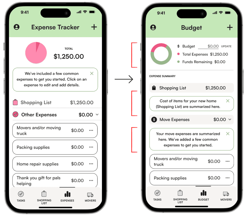
ISSUE #1 Users expected a budget vs. actualized expenses to be reflected in Budget.
SOLVE: BUDGET Added budget functionality and ability for users to compare budget to expenses. Renamed screen to Budget.
ISSUE #2 Some users expressed confusion around expenses vs. shopping list.
SOLVE: TOOL TIP Added tool tips clarifying the function of both sections of the app.
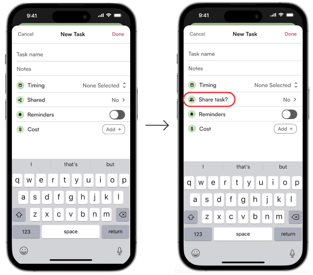
ISSUE #3: Some users interpreted this feature to mean share to social media.
SOLVE: UPDATED ICON Addressed by revising icon and copy to more clearly communicate sharing between app users.
FINAL PROTOTYPE
Check out the finalized Movelet prototype here →
CLOSING THOUGHTS
As the sole designer on this project, I leaned heavily on my initial user research, persona, and feedback from my mentor and classmates to guide my design decisions. Utilizing these assets and touch points allowed me center the end-user throughout my design process. Iterating upon the Budget feature coming out of my usability testing was an important example of this.
I was also thrilled to receive positive feedback from users during usability testing around the app feeling easy to understand thanks to familiar design patterns.
In the future, I would love to revisit my user research findings around the challenges that folks with disabilities face during the moving process and explore opportunities to help them access accommodations and community support.
