Arête
Evolving features and UI for an AI-powered styling application.
Duration: 8 weeks
Role: Digital Experience Design
Tools: Figma, Miro
PROBLEM
After launching an MVP version of the AI-powered mobile styling application Arête, its founders were looking to iterate upon on the initial design to increase user engagement and retention.
Users were struggling with completing key tasks within Arête's proprietary AI Styler feature and also consistently providing feedback on application's overall interface design.
SOLUTION
I delivered a redesign of all of the app's key features with a focus on increasing usability while elevating and enhancing the user interface.
My biggest area of focus was Arête's proprietary AI Styler, a key feature that provides personalized outfit recommendations based on user style preferences.
01. Research
LANDSCAPE RESEARCH
I began this project by familiarizing myself with the mobile applications of other multi-brand e-commerce retailers to glean an understanding of design patterns that users might be expecting. I also referenced social media platforms that shared similarities to Arête's Explore homepage.
Trends that stood out included: sans serif fonts, minimal use of color, few buttons in tiles on shopping/explore feeds with two columns, and clean edges from brands with more contemporary visual design sensibility such as Basic Space and SSENSE.
USABILITY TESTING
The Arête team completed weekly usability testing with users of the app and grouped findings together by feature in a Miro affinity board. These findings helped us prioritize the updates that I would focus on across all key features.
The highest priority issues were with the AI Styler feature, that provides personalized outfit recommendations based on user style preferences.
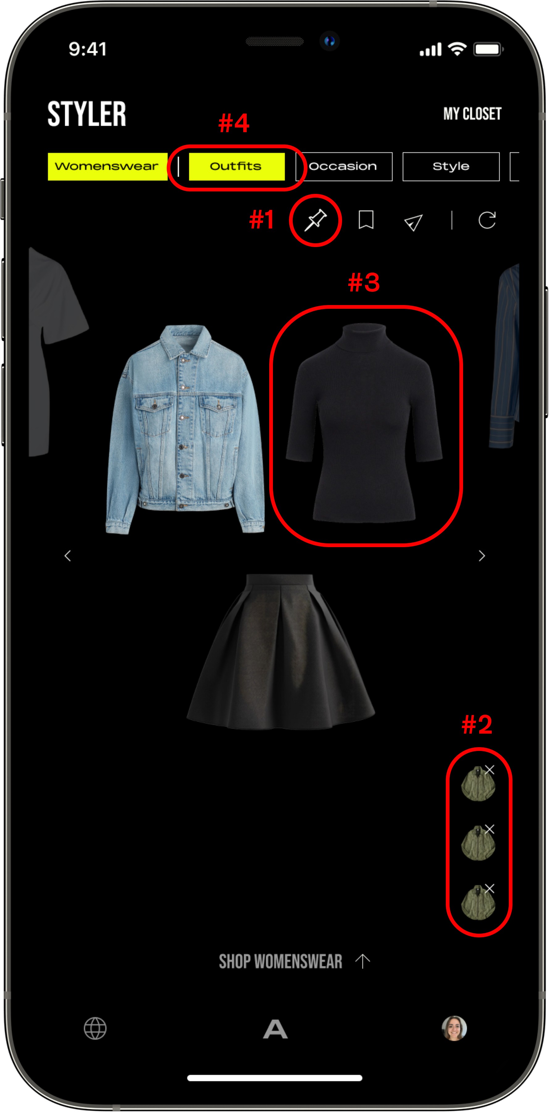
ISSUE #1 Users did not understand the purpose of the pin icon button, which allows them to “pin” one style in place while other garments on the screen are refreshed.
ISSUE #2 Users did not understand the purpose of the delete buttons, intended to allow users to delete garments from the screen.
ISSUE #3 Users called out that they could not see black garments against the black background of the styler.
ISSUE #4 Users didn’t understand the purpose of the “Outfits” filter, which allows users to select between full outfit recommendations and recommendations for specific apparel categories (Tops, Bottoms, etc.).
02. Define
AI STYLER UPDATES
Armed with an understanding of design patterns in the competitive landscape, along with insights from usability testing, I dove directly into high-fidelity wireframes for the AI Styler.
STYLE-LEVEL MENU
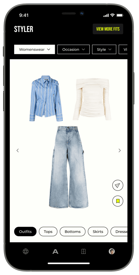
WHITE BACKGROUND
OUTFIT FILTER
Moved this filter to the bottom of the styler screen and made all available options visible, allowing users to better understand how they might use this filter to customize their experience.
REFRESHING UI
FOR KEY FEATURES
I also refreshed the UI of several other of Arête's key features with the goal of increasing usability and addressing other user issues from our affinity map. Key updates across all features included:
Streamlined user interactions by reducing the number of buttons and presenting only essential information on each screen. This approach aimed to direct users' attention to key actions, enhancing their overall experience.
Increased the use of the easily readable sans serif font Montserrat, which was already part of the design library, to ensure consistency and improve readability.
Introduced sharp corners into the Arête design language, aligning with the contemporary voice of the brand and giving the app a modern, sophisticated look.
Scaled back use of Arete's primary color yellow to focus users on explore page content and products.
EXPLORE HOMEPAGE
POST DETAILS
USER PROFILE
03. Test & Finalize
USABILITY TESTING
As I completed my Figma wireframes and prototypes, the Arête team reviewed them with users in usability tests, ensuring that they could execute key tasks in updated features.
Once features passed testing, I handed them off to the engineering team to put into production. I then QA'd feature updates in TestFlight and provided feedback to the developer team as needed.
CLOSING THOUGHTS
Having passed usability testing and received an overall positive reception from users, these feature updates are well positioned to drive an increase in user engagement and retention.
This project provided invaluable experience iterating the design of a live mobile application in close collaboration with a startup team. I was able to leverage UX and visual design principles, as well as existing design patterns in the market in make meaningful updates to the interface of the application.


